Monoline
The mark in the wild.
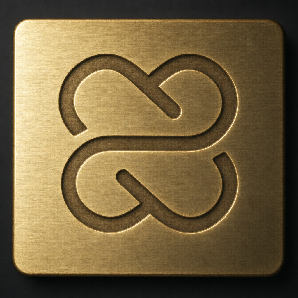
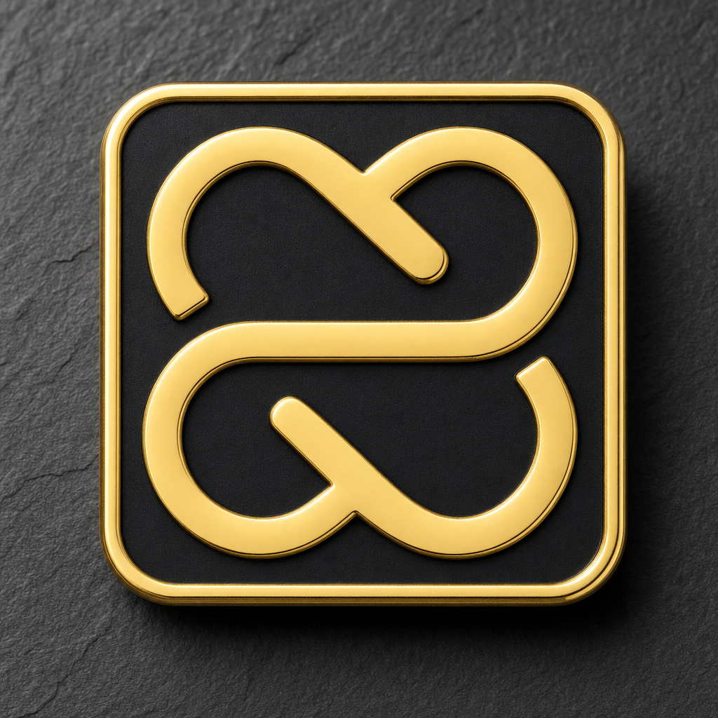
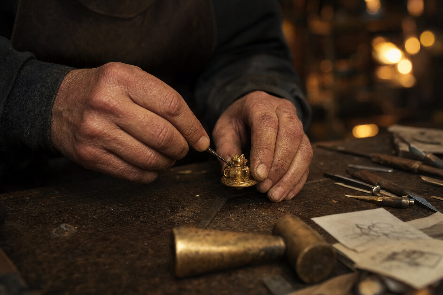
Five canonical contexts: app icon, laser engraving, embroidery, metal badge, holographic UI. Each respects the geometry above.
Applications — Examples
App icon
Laser engraving
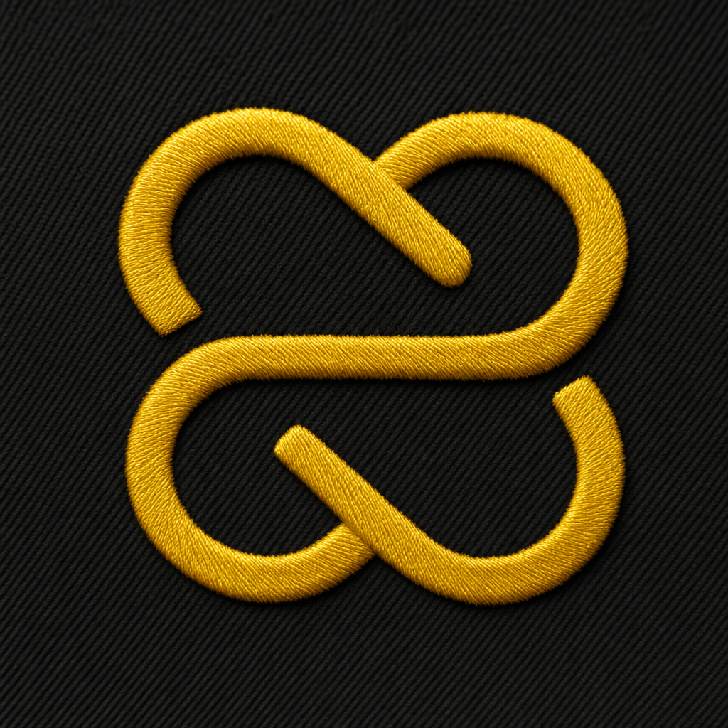
Merch — Embroidery
Metal badge
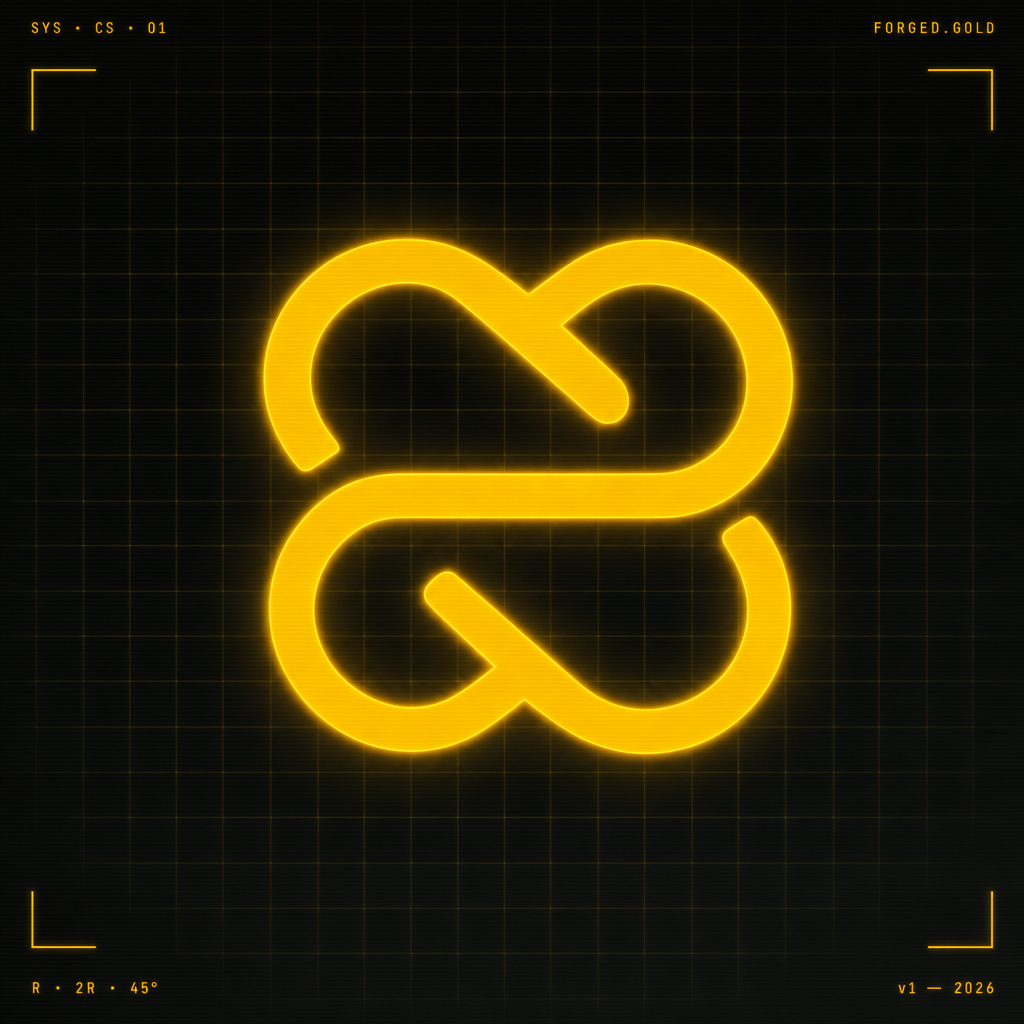
Holographic UI


Ready-to-export canvases.
OG image for share metadata, Twitter banner, Instagram square, IG/FB stories. All grid-snapped to the same R as the mark.
Tools
for makers
who ship.
Crafter Station.
Build · Ship · RepeatTools for makers who ship.
A maker collective from Lima building open tools for the next generation of crafters — in public, in code, in print.
A new
Tap for more →brand
system.
Made
by
hand.